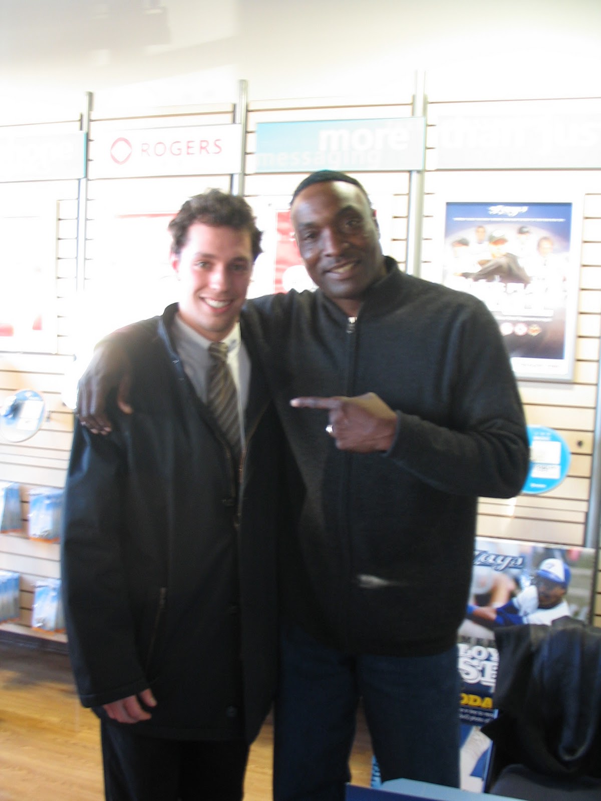
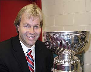
Monday, June 27, 2011

Jersey Club Quarterly Report

We're about halfway through 2011 and so far, the Jersey Club has handed out six pristine, stitched, real jerseys. Here they are:

1. Andy

The club further customized this baby with a 1994 Stanley Cup patch. Just as Mark Messier guaranteed victory, the Jersey Club guarantees perfection and authenticity which is basically as close to victory as one can get when talking about jerseys. This is a beautiful and timeless piece that any human would be lucky to have in his or her closet next to their tuxedos.

2. Phil


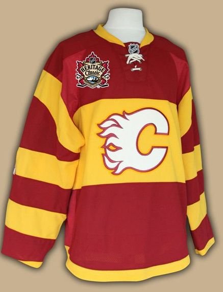
Phil is in Calgary shooting AMC's upcoming "Hell On Wheels" TV show so he wanted a jersey that he could wear to rile up cowboys in the various stables found in the city's downtown core. He opted for an Atlanta Flames Brad Marsh jersey, which tells the people of Calgary that he has no respect for the city and is willing to fuck shit up without wearing a helmet.

3. Glenn

Bo knows everything, Jersey Club knows jerseys, beers and handshakes. I've been fascinated with the career of Bo Jackson for a couple of years now and between dreaming about traveling back in time to Medieval times and easily becoming a king because I brought a gun with me, I'd dream about what sports would be like had Bo not had the hip of a 90 year old woman. This jersey encapsulates these dreams in physical form and I was very happy with this classic powder blue. The Royals haven't changed their logo or lettering in forever, which proves that you shouldn't mess with simplicity.

4, 5 and 6 - Scott T., Scott Y. and Chuck


We were very excited to participate in triple presentation this past weekend to celebrate the births and jerseys of three deserving gentlemen. For a second straight year, Scott T. opted for the freestyle option, meaning the club had the right to choose any jersey they wanted. We went with a Larry Bird, which has been described by many as "The most beautiful thing in the world". You can argue with the current Celtics lineup but you can't argue with their aesthetic and when you add that number 33 and the name BIRD (which is the best last name for a basketball player) on the back it becomes something special.

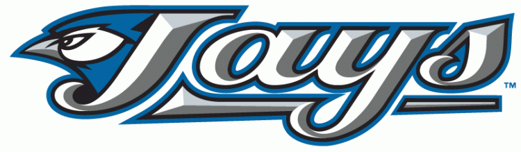
Scott Y. had a Pat Borders Jays on his list and since there's an unwritten jersey club rule that every member must possess a jersey from the Jays World Series teams of the early nineties, we decided to pull the trigger. These Jays jerseys are simply stunning and it's the hope of the club that the team will go back to these designs once they realized that their current logo looks like it was written in toothpaste.

We got Chuck a very nice Ryan Braun that matches a hat he owns. Great side patch, great stitching and a helluva ballplayer make this jersey the perfect summertime shirt. This was a refreshing jersey since most that have been presented over the last 1.5 years have been vintage. Legend has it that if you wear this jersey in any Milwaukee household, the home owner is obliged to feed you beer and sausages and send you on your way with provisions including beef jerky and Bazooka Joe gum.

Six jerseys down, six to go! Stay tuned for the latest and start thinking about your choice for Jersey of the Year. This year a fan choice category may be added.

Friday, June 24, 2011

Jersey Club Recommends

This week the jersey club would like to hand out 2 pieces of advice for those who might be thinking of buying a new jersey for their summer wardrobe.

Jersey club gives the green light to purchase a new CFL jersey.  Season starts July 1st, which gives everyone enough time to enjoy a few months before NFL starts again (maybe).

Here's my pick for a CFL jersey Argos' #44 Chad Kackert (RB). Apparently his nick name in the locker room is Kack.

Also the CFL tried live mics on the coaches and QBs in tonight's game.  It failed.  All the QBs do is call out plays that are designed so that only their team can understand.  To anyone else, just a whole bunch of random words.

The Jersey Club reluctantly gives a red light to buying a new Raptors Jonas Valanciunas.

Raptors 1st round pick we hope will be a great player one day soon, but for now we suggest holding off a few years to see how he does before you spend all your money on the lettering.

Monday, May 16, 2011

Monday Link

Hey jersey fans,

Check out this article on beer league jerseys courtesy of Yahoo.com.

Tuesday, May 10, 2011

1st year Expansion Jerseys are brutal

Of the 24 expansion teams since 1988, 13 of them had hideous jerseys in their first year. That's more than half, which is a failing grade, expansion teams.

So is there a rule that says expansion teams in their first year have to have shitty jerseys? Or is it just that marketing teams hired by new professional sports teams don't understand basic eye pleasing combinations of colours and trim and cool animals biting things? If you don't know what I'm talking about, just have a look for yourself:
3 of the many awful inaugural expansion team jerseys.


I don't know what to hate more about the 3 jerseys you see above. Is it the hideous colours? Is it the godawful font choice? How about disgusting trim? These jerseys (and many more) have the same problem in common. They were trying to be too bold - too different. Everyone was trying to recreate the phenomenon that was the San Jose Sharks circa 1991.
I have no idea who this Colman fellow is.
Everyone in the world (ok, just North America) was really surprised when in the early nineties, kids started buying the latest NHL expansion jersey paraphernalia. They couldn't explain it. I remember them actually doing real news stories on it because no one could understand why American kids (and Canadian as well) were wearing the crappiest hockey team's jersey like it was something cool. In the end everyone agreed it was because of the weird new colour, teal. However teal was only part of the reason the jersey was a success. Look at that font. Classic. Look at that design - clean lines, no one trying to make this jersey memorable by being hideous, the bold decision of the colour stands out but we are comfortable with it because we recognize the other features. Add in a pretty cool logo of a crazy wild animal biting something and you have a damn fine jersey.

Scott "The Teal Bulb" Pose
All that being said, teal was pretty much dead by 1992 and no other expansion team since has recreated the hype and popularity that the Sharks had in the 90s. Instead it's been a stream of duds including the Devil Rays:
Can I say Devil Gays? No?
And of course the lowly Raptors:

Uh guys I think there's something wrong with the pinstripes.
Oh and you named the team Raptors by mistake too.
So then, here's a list of all the awful inaugural expansion jerseys of all the major North American sports. All these jerseys had some garbage bozo designing them and while some have improved since, some continue to be completely terrible. These jerseys have some and maybe even all of the following: poor colour choice, bad overall design, awful logo, terrible trim and brutal fonts.


NHL NBA      NFL    MLB
panthers hornets      jaguars    diamondbacks
thrashers raptors    marlins
wild grizzlies    devil rays
blue jackets  bobcats
thrashers timberwolves


Wednesday, April 13, 2011

PLAYOFFS

The playoffs start today and with them we will see the rise of some new playoff heros.  Having a heroic playoff run can really lift the stock of a players jersey and make it a collectible for years to come. 

As I was recently shopping for some classic playoff jerseys for the Jersey Club, I turned to the Hockey Hall of Fame assuming that they would carry them.  Since the NHL and RBK have a liscensing deal, the HHOF only carries RBK jerseys.  Well RBK only makes current jerseys with a few classics in their roster.  So obviously I was disappointed when they told me they don't make the away version of the 1994 Messier Rangers, nor do they make the 1998 or 2002 Yzerman redwings.  How long until they stop making the 2010 Toews or a 1993 Roy?  So here's my suggestion to RBK and the NHL, come out with a line of "Playoff heros".  Every year before the playoffs you re-release jerseys of some classic playoff heros and you release them for as many teams as possible that are in the current playoffs.

Obviously you have the staples Gretzky, Messier, Yzerman and Gilmour every year so here is my list of playoff heros for this year.  

J.S. Giguere - 2003 Ducks

In 2003, the Ducks did not sport everyone's favorite jersey, but there is no denying that any loyal Ducks fan has to appreciate Giggy's Conn Smythe winning performance that year.  He went 15 - 6 with 5 SO, a 0.945 sv pct. and a 1.62 GAA.  Not to mention he only gave up 1 goal against Minnesota in the entire series and set a then record shutout streak of 217 minutes and 54 seconds (since broken by Bryzgalov)


Patrick Kane - 2010 Blackhawks
Normally I would pick Toews, but Kane does score the cup winning goal and I sort of feel bad for him.  Kane fulfills his dream of scoring the winning goal, to bad he was the only one that knew he scored and had to celebrate by himself, like how I used to do it in my basement.

Pavel Bure - 1994 Canucks 
The Canucks made it to game 7 of the cup finals as a 7th seed.  I mostly remember hating Kirk McLean for shutting out the Leafs twice in the conference finals, but it was really Bure's 31 pts in that playoff run that lead them to being one win away from have the stanley cup.


As for the rest of the teams in the western conference this year, Nashville does not have any playoff heroes to date, neither do the sharks and the redwings is always going to be Yzerman which should be released every year no matter who's in the playoffs similarly, LA will always be Gretzky.  So I'm calling in a wild card this year and going to honour my favorite playoff goal of all time.

Nikolai Borschevsky - 1993 Leafs
Oh man, some good memories with this one.  I bruised my achilles celebrating while on vacation in florida.  Yes Leafs hockey was broad casted in southern US once upon a time.

 Stay Tuned as tomorrow I will look at the Eastern Conference.  Who will represent Boston, Orr or Bourque? 

Thursday, April 7, 2011

Jersey Game

Hey here's a fun game to play to test your knowledge on Jersey popularity.  Try to name the 20 most popular baseball jerseys (by sales volume) in 2010 in 2:00 minutes.  I know the site looks sketchy but I tried it and it didn't kill my computer, obviously as I am using it to post this blog.

http://www.sporcle.com/games/pamrhein/the-10-best-selling-mlb-jerseys-2010

My score was 15/20.  The person with the lowest score has to give me a jersey.

Friday, April 1, 2011

Let's Go Blue Jays

There are a few things in life that I will never understand. Why Gary Bettman got a contract extension, how UPS has managed to take away everything convenient about home courier delivery and finally why the Blue Jays ever changed their logo from the classic that we all love.  I'm all for trying new things, but if they don't work it's okay to just give up and go back to the classics.

The classic jay is simple but intricate.  They encompass national pride, the team and the sport all in one.

I might be bias, partly because it represents the World Series years and partly because I spent countless hours drawing it in school and partly because everything that has come after pales in comparison.  

Much like the jays themselves, we saw a steady decline that started in the mid to late 90's when they unveiled the new look.


This logo received 7.5/10 rating on Chris Creamer's sportslogos.nethttp://www.sportslogos.net/index.php
This wasn't the only bad decision made by the Jays during this era.  They also fired Cito and hired Tim Johnson as manager who used to tell made up war stories to the players about being a Vietnam vet.  Oh and this was the beginning of Roger Clemens steroid era.

The decline continues in 2003 when they switched to this most hanus logo.  This lasted only one season, one season too long.  Basically they stole the Texas Rangers T logo and stuck sinister looking Blue Jay on it. 

This Jay is clearly on steroids.
I will admit I own a jersey from this logo year, but I bought it at Value Village for $2.99 and got it signed by Lloyd Moseby at my local Rogers Video before posing for this pic. 
The lady couldn't work my camera making this a drawn out process.  Lloyd then made a gay joke about having his arm around me for that long.

That brings us to the present or what I like to call the Tampa years.  When unveiled in 2004, it reminded me too much of something the garbage Rays would wear.  Fittingly in '04 the Jays went 67-94 and Tampa went 70-91.  
As it turns out, modeling the team after Tampa not such a bad idea as stock piling young talent actually does work, a foreign concept for Toronto franchises (Burn). 

The jays new season starts today and there is hope in the direction the team is going.  If these logos are any indication of the direction the franchise is in, the worst is behind us and the best is yet to come.

Wednesday, March 30, 2011

80's are back?

I recently added two new pieces to my sports clothing wardrobe.  One was a NY Islanders hat that my girlfriend bought for me at the RBK store in NYC, the other was a Winnipeg Jets jersey with Hawerchuk #10.  It was then when I noticed how similar the two logos are.


Then I went back and read the first post of this blog which brought to our attention the growing number of new jerseys that feature logos designed in a circle.  Could it be that this is just the 80's jersey fashion coming back around?

Excluding the Bruins, we saw this start in the 70's with the Sabres and the Islanders, but it was in the 80's that this really took off.  First the Oilers and the Jets bringing their style from the WHA.  Then the Devils in '82, followed by the Canucks in '85.  Unfortunately for some of these teams it's only the jerseys that seem to be coming back and not the Stanley Cup.

I for one like the 80's being back.  It was a decade that saw Gretzky and the Canada Cup, Stevie Y, Youngblood and countless more of the hockey's greatest moments.  I also hope it sticks around because I am not ready for a rehash of what the 90's brought.


Friday, March 25, 2011

Jersey Club Salutes: Ed Belfour

When it comes to players who have played on multiple teams and have thus worn multiple jerseys throughout their career, it is tougher to find a better collection than Ed Belfour's.

Starting with his early days in Chicago, Belfour played for some huge franchises and created some great jersey memories along the way.

CHICAGO: The "We almost made it, but look at all my trophies" years.
If you had given me one of these (a signed 8x10 glossy, autographed) in 92 I would have pooed my dungarees.

Eddie loaded up on trophies in his rookie year, winning the Calder (best rookie), Vezina (best goalie), Jennings (least goals allowed) and being nominated for the Hart (MVP). His Pro Set 91-92 card really tells the whole story, though:
A classic suit and hairstyle for some classic accolades.
Side note: don't you love the old NHL symbol? There's something about orange and black that was so unique as opposed to the current silver and black. Also going from upper left to lower right will always be my preferred way to read acronyms.

SAN JOSE: The "I played for San Jose?" year.

After his Gretzky-esque season of winning three trophies, followed by a Stanley Cup Finals appearance in 93 and a few more Jennings/Vezina wins in a few more following years, Eddie was shipped off to San Jose for half of a season. With some dismal stats playing on one of the worst teams in the league, many short sighted hockey fans figured Eddie the Eagle had gone "tits up". But jersey enthusiasts the world over were clamouring for a teal, black and white beauty sporting Belfour on the back and saying that The Eagle was still very much indeed "tits down".


DALLAS: The "I swear, it was Guy Carbonneau" years.


For any of you who are unaware of the story, it goes like this: Ed Belfour backstopped the The Dallas Stars to the Stanley Cup in 1999. The Dallas Stars celebrated like you used to be able to after you won the cup. (as in, you partied hard with the cup without this asshole following you around everywhere) During this partying, it is alleged that Stars captain Guy Carbonneau attempted to throw the Stanley Cup into the hotel pool from a balcony. He missed and it hit the pool deck, badly denting sports' greatest trophy. This is the accepted story - however I submit the following: would stalwart leader and notable NHL captain Guy Carbonneau do this? Or does it sound more like the work of someone who would make this face while drunk and posing for a picture?
Trust me, if Eddie didn't try to deep six the cup, he did way worse things.
FUBU: The "For us, by us - Us being me, Ed Belfour and my scary cocaine addled friends that only live in my head" years

In addition to the billion clams, I offer you the entire internet and Teemu Selanne's first born son. Oh and a jet that talks.

Ed Belfour was physically subdued and arrested for a misdemeanor crime when a woman he was with in a Dallas hotel room said she became frightened and called police. He allegedly offered Dallas police officers one billion dollars for his scott-free release. It is notable by jersey scholars that at the time of his fight with cops/arrest/hilarious bribe attempt, that he was wearing a sweater sporting a popular gangsta-clothing line "Fubu" sweat shirt.  When talking about notable jerseys or, sweaters if you will, that Belfour has worn in his career, this has to rank right up there.

TORONTO: The "You all thought I was dead didn't you!?" years.

Rebounding from the embarrassing Fubu sweater incident, Eddie made his way to Toronto to help the Leafs put fourth some strong playoff efforts mostly against the Ottawa Senators and not really against anyone else. These days it's tough to find someone in a that-era (mid-early 2000's) Leafs jersey and not shudder in shame. Some names way too many Leaf fans still, for some reason, proudly sport: Tucker, Domi, McCabe, Francis, and Lindros. Luckily during this fairly forgettable Leaf era, some names stand above the rest as still very wearable: Roberts, Mogilny, Sundin and of course, Belfour.

FLORIDA: The "I should have retired in Toronto or at least asked to be traded to a better team" years.

While the Florida Panthers are and probably always will be a piece of garbage franchise that shouldn't exist at all, you have to admit Eddie looks good in that jersey. Nevermind the obvious clash of wearing a fierce cat on your jersey and a fierce bird on your helmet, if you are (for some unholy reason) a Panthers fan, I wouldn't mind sporting a #20. This is also the best Florida Panthers era for jerseys.

So there you have it, Ed "The Eagle" Belfour. A great jersey collection for a great career. Next up: I don't know, ask Stein or Glenn.

Screw off Pritchard!

Thursday, March 24, 2011

Wisdom

I'd just like to share a passage from the blog of a store I like:

The other day I overheard someone say "Who still wears nba jerseys in 2011." I thought to myself for a second and I couldn't think back to a time when I didn't rock a Champion jersey in the summer. Whether it be at the beach, a bbq or just loungin' around the house there always a few hanging in my closet. I understand it was a fad in the mid 2000's when Mitchell & Ness throwbacks we're hotter than a whore house on nickel night but a classic 90's Champion jersey will never go out of style IMO. We have a couple Pippen Authentic (stitched) Champion jerseys in stock (sz 44) and I forgot how amazing the quality on these were back in the day.....don't sleep.

I couldn't have said it better myself. Also notice the attention to stitching in the last sentence. Check out http://forall2envy.blogspot.com.

Thursday, March 17, 2011

Happy St. Patrick's day from the Jersey McClub.

Here's a post about some Irish Jerseys. 

The leafs typically "sham"rock the St. Pat's jersey on this day, but normally they aren't in a heated playoff race, so hopefully they are focused on tonight's game and don't "irish car" bomb tonight like they did against Tampa.
http://markosun.files.wordpress.com/2010/01/maple-leafs5.gif?w=208&h=200

The NCAA tournament tips off today, and the Notre Dame Fighting Irish are a high #2 seed in their part of the bracket, as if college students needed more of a reason to drink.

http://images.footballfanatics.com/productImages/_487000/ff_487450_xl.jpg

Now for some Jerseys that are actually from Ireland.
I learned about Hurling when I was in Ireland, and wished that they tried to bring it to North America.  Here's some background reading. 
Here are a few of the jerseys from Limerick, Cork, Leitrim
http://www.limerickgaajersey.com/images/Limerick-jerseys.jpg http://www.oneills.com/DatabaseImages/prd_9387087.jpghttp://www.oneills.com/DatabaseImages/prd_6230498.jpg
I would proudly wear one of these Jerseys, especially that Cork one in the middle. These have everything you could ask for, league emblem, fit like a shirt, and each team has an awesome club crest.  Look at some of these crests.
http://www.millstreet.ie/blog/wp-content/uploads/2011/02/Cork-GAA-Crest.jpg http://img.rasset.ie/00015cb1-250.jpghttp://athleathan.com/images/smallcrest.png

The beauty of a crest is that no matter what the club chooses to do with the jersey design the crests will always be the same.  Tradition is a common theme is some of my favorite jerseys.  

That's about all the Irish jerseys I can think of other then the Boston Celtics, but that's pretty obvious.  Everyone enjoy your stouts and array of drinks with the name bomb in them and don't forget to do a couple McNultys


Wednesday, March 16, 2011

March Madness

The March Madness tournament is 1 day away and as I purely guess on my bracket and watch episodes of Coach to try to get interested in college sports (it was either that or episodes of Hang Time but that's high school), I am realizing that, out of the 64 teams in this tournament, there is not one jersey that I want to own.

College jerseys, basketball or football are all the same, most of the team names are the same too for that matter (at least 4 in this tournament are Wildcats).
http://www.chasebudinger.org/images/chase-budinger-jersey2.jpghttp://t2.gstatic.com/images?q=tbn:ANd9GcQMjJx93-7GLylDXOjOb501Ynagy7lrdLsy2wZu03LfsCMkLHkF&t=1http://img3.prosperent.com/images/250x250/images.footballfanatics.com/productImages/_175000/FF_175033_xl.jpghttp://images.footballfanatics.com/productImages/_109000/FF_109793_l.jpg

With a cool name like wildcats, you could design a pretty decent logo for the jersey.  So why don't colleges market their jerseys more and make them a bigger selling feature?  I can only guess, so here's a list of my guesses.

#1. Unless you're a player, sports is not the purpose of school.

When you walk in to your campus store, and you have to pick between a jersey and a regular piece of everyday clothing, you are going to take those clothes every time.  Jerseys at the Kansas State store go for $75, this very smart button down retails for $30.  In the US college economy that translates into roughly 70 watered down beers.  Enough to get you through your teams opening round upset followed by a crushing round 2 loss.   Then later in life you will still have a nice button that you can put into your regular rotation which will remind you of the 4 great years you had meeting new people and shaping your life to be a successful, contributing member of society (the purpose of school) as opposed to a jersey that just reminds you of how embarrassingly drunk you got and that you didn't really have any connection to that team other then you had to cheer for them since you shared facilities.

#2.  College success is not jersey worthy.

Out of your entire team, you might have one or two players go on to be decent NBA regulars.  But until that happens, there is no way of knowing.  Do you want to run that risk of buying a jersey of a guy that was drafted and never panned out?  Wearing that around would be as embarrassing as wearing an Alexander Daigle Senators jersey.  You would end up lying about how you like the jersey and that the #29 represents the address of your student house, or some lame joke about how you dated 29 girls while in school.  Either way, you are not going to take that chance.  You wait until well after a storied pro career, then you buy the college jersey once it's cool (like a North Carolina #23)

#3.  Do you want to honour players you really don't like.

Unlike your favorite pro players who you grew up watching, you don't really want to support the players on the team.  Are you really going to wear a jersey of the guy that you have anthropology with but you never see?  Or the guys that get to skip the line at the campus bar while you wait in the cold?  And they get to do this while on full scholarships.  Your hard earned summer painting job money goes straight to tuition and a trip to Europe when schools over, you're not going to spend that on a jersey.

So with the vast majority of students not a part of the team and all of them with now at least 3 good reasons to not buy a jersey of their school, there is not enough of a market for Colleges and Universities to start improving the design of their jerseys.  And even if they did, the only NCAA jersey I would buy is that of the Minnesota State Screaming Eagles!!!

Now let's all enjoy some average quality basketball, where the last 2 minutes actually takes 2 minutes and we can cheer on our randomly selected upsets.  Go Penn State!!

Monday, March 14, 2011

I Almost Forgot!

As a little addition to a previous post on the state of current NHL logo's featured on 3rd jerseys I have discovered yet another logo incased in a circle with the name of the team in yet another circle.

Remember this lineup?

Well here's another one I forgot about.
Look NHL, we get it. This is a slick and stylish yet classic design for a logo. But should 20% of the teams in the league have it as an alternate? ITS CALLED DIVERSIFICATION PEOPLE--


Sunday, February 27, 2011

This Month In Jerseys

The Jersey Club looks back on the month of February in the world of Jerseys

We would like to salute the ATP for their choice to give Canadian Milos Raonic a San Jose Sharks jersey as a gift when he won the SAP open earlier this month.


http://farm5.static.flickr.com/4141/5445548991_be40b77b72.jpg


Paul Henderson is in the 2nd month of the Henderson Jersey Tour.  This month saw Henderson and more importantly his game worn Jersey from the '72 series arrive at the Air Canada Center.  Here are some of the exciting photos from the tour thus far and a video of Saturday night.  You can see these and more on the official facebook page.


Also, February was the 2nd Heritage Classic.  I am a big fan of these outdoor games for two reasons, outdoor hockey for no good reason other then nostalgia is more fun and you get to see fantastic retro jerseys, like the one below.
If you don't know what love is, just look at Lanny's face!

These outdoor games have also spawned a new craze which is designing new jerseys for special events like the winter classic and the heritage classic.  It used to be the case, where a commemorative patch was enough, but patches don't sell like jerseys do.  Patches vs. Jerseys, it's a debate the club will look at in the future.  I'm a patch guy as some some of these jerseys aren't great, but I think the flames got it right this year.

I got my year end bonus from work!!  With that money coming in the month of February, I think it's my duty as a Canadian to take it and my unnamed 2010 Team Canada Jersey and Crosby that shit.  One year ago Feb. 28, Crosby scored the goal which will be the most memorable goal of my life and created probably the most popular Jersey in Canada for the next 20+ years until we get the olympics again.


Finally, February is the first jersey of Jersey Club.  Here are some the jerseys in consideration for the first presentation of 2011.
1994 New York Rangers Stanley Cup Jersey (dark away), 2010-2011 Steven Stamkos Lightning (dark home), 2010 Team Canada Rick Nash, 1993 Toronto Blue Jays Road Grey.  Vote for your choice and keep following the blog for the results*

*results are not based on reader's votes.  That is there to falsely give readers the feeling of being a part of the group