 There are a few things in life that I will never understand. Why Gary Bettman got a contract extension, how UPS has managed to take away everything convenient about home courier delivery and finally why the Blue Jays ever changed their logo from the classic that we all love. I'm all for trying new things, but if they don't work it's okay to just give up and go back to the classics.
 The classic jay is simple but intricate. They encompass national pride, the team and the sport all in one.
I might be bias, partly because it represents the World Series years and partly because I spent countless hours drawing it in school and partly because everything that has come after pales in comparison.
Much like the jays themselves, we saw a steady decline that started in the mid to late 90's when they unveiled the new look.
 | |
| This logo received 7.5/10 rating on Chris Creamer's sportslogos.nethttp://www.sportslogos.net/index.php |
The decline continues in 2003 when they switched to this most hanus logo. This lasted only one season, one season too long. Basically they stole the Texas Rangers T logo and stuck sinister looking Blue Jay on it.
 |
| This Jay is clearly on steroids. |
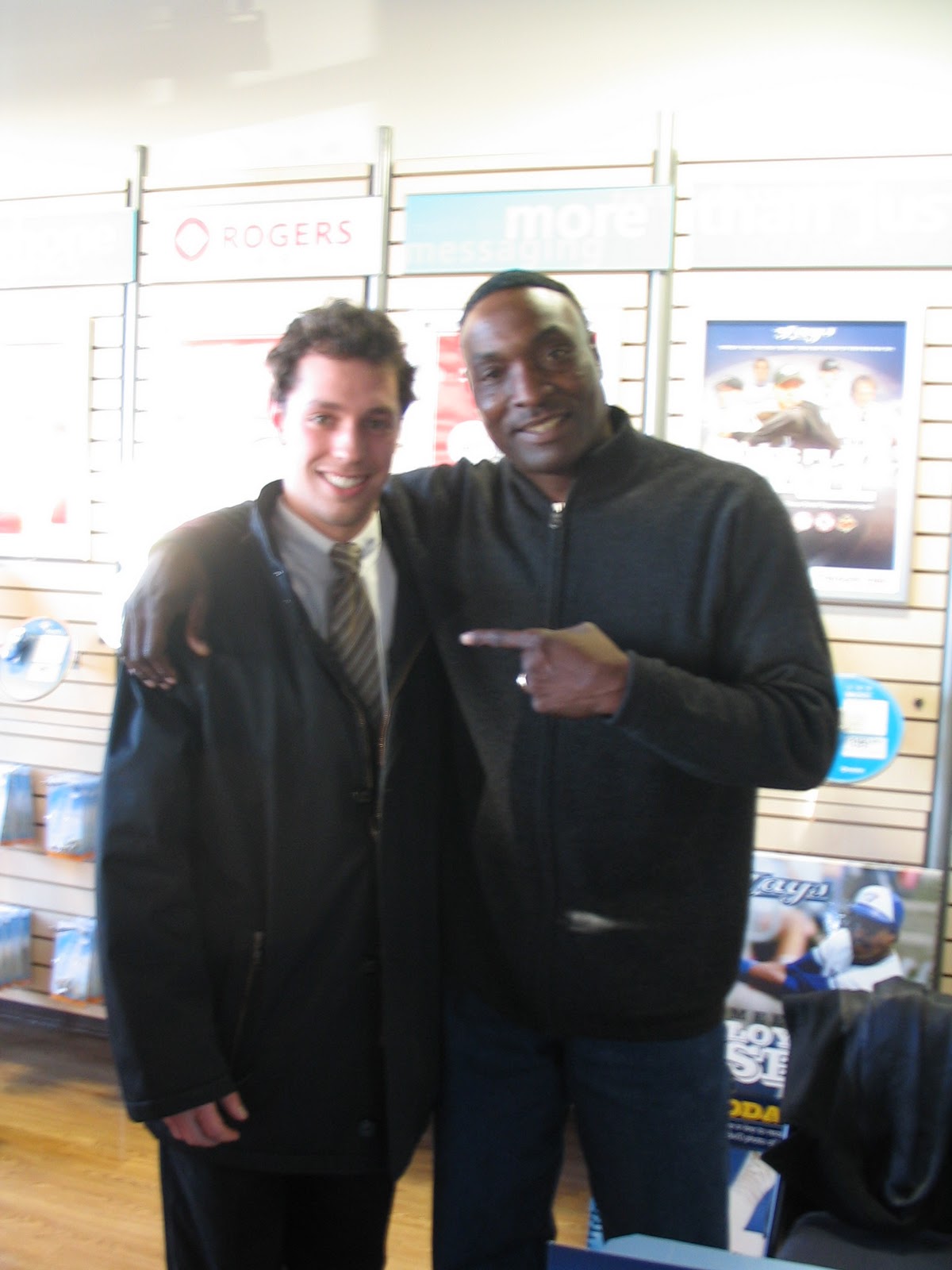 |
| The lady couldn't work my camera making this a drawn out process. Lloyd then made a gay joke about having his arm around me for that long. |
That brings us to the present or what I like to call the Tampa years. When unveiled in 2004, it reminded me too much of something the garbage Rays would wear. Fittingly in '04 the Jays went 67-94 and Tampa went 70-91.
The jays new season starts today and there is hope in the direction the team is going. If these logos are any indication of the direction the franchise is in, the worst is behind us and the best is yet to come.
No comments:
Post a Comment