Wednesday, March 30, 2011

80's are back?

I recently added two new pieces to my sports clothing wardrobe.  One was a NY Islanders hat that my girlfriend bought for me at the RBK store in NYC, the other was a Winnipeg Jets jersey with Hawerchuk #10.  It was then when I noticed how similar the two logos are.


Then I went back and read the first post of this blog which brought to our attention the growing number of new jerseys that feature logos designed in a circle.  Could it be that this is just the 80's jersey fashion coming back around?

Excluding the Bruins, we saw this start in the 70's with the Sabres and the Islanders, but it was in the 80's that this really took off.  First the Oilers and the Jets bringing their style from the WHA.  Then the Devils in '82, followed by the Canucks in '85.  Unfortunately for some of these teams it's only the jerseys that seem to be coming back and not the Stanley Cup.

I for one like the 80's being back.  It was a decade that saw Gretzky and the Canada Cup, Stevie Y, Youngblood and countless more of the hockey's greatest moments.  I also hope it sticks around because I am not ready for a rehash of what the 90's brought.


Friday, March 25, 2011

Jersey Club Salutes: Ed Belfour

When it comes to players who have played on multiple teams and have thus worn multiple jerseys throughout their career, it is tougher to find a better collection than Ed Belfour's.

Starting with his early days in Chicago, Belfour played for some huge franchises and created some great jersey memories along the way.

CHICAGO: The "We almost made it, but look at all my trophies" years.
If you had given me one of these (a signed 8x10 glossy, autographed) in 92 I would have pooed my dungarees.

Eddie loaded up on trophies in his rookie year, winning the Calder (best rookie), Vezina (best goalie), Jennings (least goals allowed) and being nominated for the Hart (MVP). His Pro Set 91-92 card really tells the whole story, though:
A classic suit and hairstyle for some classic accolades.
Side note: don't you love the old NHL symbol? There's something about orange and black that was so unique as opposed to the current silver and black. Also going from upper left to lower right will always be my preferred way to read acronyms.

SAN JOSE: The "I played for San Jose?" year.

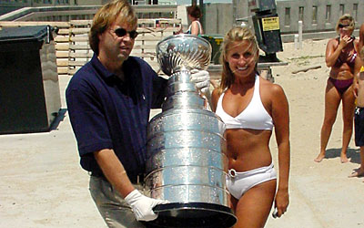
After his Gretzky-esque season of winning three trophies, followed by a Stanley Cup Finals appearance in 93 and a few more Jennings/Vezina wins in a few more following years, Eddie was shipped off to San Jose for half of a season. With some dismal stats playing on one of the worst teams in the league, many short sighted hockey fans figured Eddie the Eagle had gone "tits up". But jersey enthusiasts the world over were clamouring for a teal, black and white beauty sporting Belfour on the back and saying that The Eagle was still very much indeed "tits down".


DALLAS: The "I swear, it was Guy Carbonneau" years.


For any of you who are unaware of the story, it goes like this: Ed Belfour backstopped the The Dallas Stars to the Stanley Cup in 1999. The Dallas Stars celebrated like you used to be able to after you won the cup. (as in, you partied hard with the cup without this asshole following you around everywhere) During this partying, it is alleged that Stars captain Guy Carbonneau attempted to throw the Stanley Cup into the hotel pool from a balcony. He missed and it hit the pool deck, badly denting sports' greatest trophy. This is the accepted story - however I submit the following: would stalwart leader and notable NHL captain Guy Carbonneau do this? Or does it sound more like the work of someone who would make this face while drunk and posing for a picture?
Trust me, if Eddie didn't try to deep six the cup, he did way worse things.
FUBU: The "For us, by us - Us being me, Ed Belfour and my scary cocaine addled friends that only live in my head" years

In addition to the billion clams, I offer you the entire internet and Teemu Selanne's first born son. Oh and a jet that talks.

Ed Belfour was physically subdued and arrested for a misdemeanor crime when a woman he was with in a Dallas hotel room said she became frightened and called police. He allegedly offered Dallas police officers one billion dollars for his scott-free release. It is notable by jersey scholars that at the time of his fight with cops/arrest/hilarious bribe attempt, that he was wearing a sweater sporting a popular gangsta-clothing line "Fubu" sweat shirt.  When talking about notable jerseys or, sweaters if you will, that Belfour has worn in his career, this has to rank right up there.

TORONTO: The "You all thought I was dead didn't you!?" years.

Rebounding from the embarrassing Fubu sweater incident, Eddie made his way to Toronto to help the Leafs put fourth some strong playoff efforts mostly against the Ottawa Senators and not really against anyone else. These days it's tough to find someone in a that-era (mid-early 2000's) Leafs jersey and not shudder in shame. Some names way too many Leaf fans still, for some reason, proudly sport: Tucker, Domi, McCabe, Francis, and Lindros. Luckily during this fairly forgettable Leaf era, some names stand above the rest as still very wearable: Roberts, Mogilny, Sundin and of course, Belfour.

FLORIDA: The "I should have retired in Toronto or at least asked to be traded to a better team" years.

While the Florida Panthers are and probably always will be a piece of garbage franchise that shouldn't exist at all, you have to admit Eddie looks good in that jersey. Nevermind the obvious clash of wearing a fierce cat on your jersey and a fierce bird on your helmet, if you are (for some unholy reason) a Panthers fan, I wouldn't mind sporting a #20. This is also the best Florida Panthers era for jerseys.

So there you have it, Ed "The Eagle" Belfour. A great jersey collection for a great career. Next up: I don't know, ask Stein or Glenn.

Screw off Pritchard!

Thursday, March 24, 2011

Wisdom

I'd just like to share a passage from the blog of a store I like:

The other day I overheard someone say "Who still wears nba jerseys in 2011." I thought to myself for a second and I couldn't think back to a time when I didn't rock a Champion jersey in the summer. Whether it be at the beach, a bbq or just loungin' around the house there always a few hanging in my closet. I understand it was a fad in the mid 2000's when Mitchell & Ness throwbacks we're hotter than a whore house on nickel night but a classic 90's Champion jersey will never go out of style IMO. We have a couple Pippen Authentic (stitched) Champion jerseys in stock (sz 44) and I forgot how amazing the quality on these were back in the day.....don't sleep.

I couldn't have said it better myself. Also notice the attention to stitching in the last sentence. Check out http://forall2envy.blogspot.com.

Thursday, March 17, 2011

Happy St. Patrick's day from the Jersey McClub.

Here's a post about some Irish Jerseys. 

The leafs typically "sham"rock the St. Pat's jersey on this day, but normally they aren't in a heated playoff race, so hopefully they are focused on tonight's game and don't "irish car" bomb tonight like they did against Tampa.
http://markosun.files.wordpress.com/2010/01/maple-leafs5.gif?w=208&h=200

The NCAA tournament tips off today, and the Notre Dame Fighting Irish are a high #2 seed in their part of the bracket, as if college students needed more of a reason to drink.

http://images.footballfanatics.com/productImages/_487000/ff_487450_xl.jpg

Now for some Jerseys that are actually from Ireland.
I learned about Hurling when I was in Ireland, and wished that they tried to bring it to North America.  Here's some background reading. 
Here are a few of the jerseys from Limerick, Cork, Leitrim
http://www.limerickgaajersey.com/images/Limerick-jerseys.jpg http://www.oneills.com/DatabaseImages/prd_9387087.jpghttp://www.oneills.com/DatabaseImages/prd_6230498.jpg
I would proudly wear one of these Jerseys, especially that Cork one in the middle. These have everything you could ask for, league emblem, fit like a shirt, and each team has an awesome club crest.  Look at some of these crests.
http://www.millstreet.ie/blog/wp-content/uploads/2011/02/Cork-GAA-Crest.jpg http://img.rasset.ie/00015cb1-250.jpghttp://athleathan.com/images/smallcrest.png

The beauty of a crest is that no matter what the club chooses to do with the jersey design the crests will always be the same.  Tradition is a common theme is some of my favorite jerseys.  

That's about all the Irish jerseys I can think of other then the Boston Celtics, but that's pretty obvious.  Everyone enjoy your stouts and array of drinks with the name bomb in them and don't forget to do a couple McNultys


Wednesday, March 16, 2011

March Madness

The March Madness tournament is 1 day away and as I purely guess on my bracket and watch episodes of Coach to try to get interested in college sports (it was either that or episodes of Hang Time but that's high school), I am realizing that, out of the 64 teams in this tournament, there is not one jersey that I want to own.

College jerseys, basketball or football are all the same, most of the team names are the same too for that matter (at least 4 in this tournament are Wildcats).
http://www.chasebudinger.org/images/chase-budinger-jersey2.jpghttp://t2.gstatic.com/images?q=tbn:ANd9GcQMjJx93-7GLylDXOjOb501Ynagy7lrdLsy2wZu03LfsCMkLHkF&t=1http://img3.prosperent.com/images/250x250/images.footballfanatics.com/productImages/_175000/FF_175033_xl.jpghttp://images.footballfanatics.com/productImages/_109000/FF_109793_l.jpg

With a cool name like wildcats, you could design a pretty decent logo for the jersey.  So why don't colleges market their jerseys more and make them a bigger selling feature?  I can only guess, so here's a list of my guesses.

#1. Unless you're a player, sports is not the purpose of school.

When you walk in to your campus store, and you have to pick between a jersey and a regular piece of everyday clothing, you are going to take those clothes every time.  Jerseys at the Kansas State store go for $75, this very smart button down retails for $30.  In the US college economy that translates into roughly 70 watered down beers.  Enough to get you through your teams opening round upset followed by a crushing round 2 loss.   Then later in life you will still have a nice button that you can put into your regular rotation which will remind you of the 4 great years you had meeting new people and shaping your life to be a successful, contributing member of society (the purpose of school) as opposed to a jersey that just reminds you of how embarrassingly drunk you got and that you didn't really have any connection to that team other then you had to cheer for them since you shared facilities.

#2.  College success is not jersey worthy.

Out of your entire team, you might have one or two players go on to be decent NBA regulars.  But until that happens, there is no way of knowing.  Do you want to run that risk of buying a jersey of a guy that was drafted and never panned out?  Wearing that around would be as embarrassing as wearing an Alexander Daigle Senators jersey.  You would end up lying about how you like the jersey and that the #29 represents the address of your student house, or some lame joke about how you dated 29 girls while in school.  Either way, you are not going to take that chance.  You wait until well after a storied pro career, then you buy the college jersey once it's cool (like a North Carolina #23)

#3.  Do you want to honour players you really don't like.

Unlike your favorite pro players who you grew up watching, you don't really want to support the players on the team.  Are you really going to wear a jersey of the guy that you have anthropology with but you never see?  Or the guys that get to skip the line at the campus bar while you wait in the cold?  And they get to do this while on full scholarships.  Your hard earned summer painting job money goes straight to tuition and a trip to Europe when schools over, you're not going to spend that on a jersey.

So with the vast majority of students not a part of the team and all of them with now at least 3 good reasons to not buy a jersey of their school, there is not enough of a market for Colleges and Universities to start improving the design of their jerseys.  And even if they did, the only NCAA jersey I would buy is that of the Minnesota State Screaming Eagles!!!

Now let's all enjoy some average quality basketball, where the last 2 minutes actually takes 2 minutes and we can cheer on our randomly selected upsets.  Go Penn State!!

Monday, March 14, 2011

I Almost Forgot!

As a little addition to a previous post on the state of current NHL logo's featured on 3rd jerseys I have discovered yet another logo incased in a circle with the name of the team in yet another circle.

Remember this lineup?

Well here's another one I forgot about.
Look NHL, we get it. This is a slick and stylish yet classic design for a logo. But should 20% of the teams in the league have it as an alternate? ITS CALLED DIVERSIFICATION PEOPLE--